


This article is part of our The Z Files series.
Don't look now, but we're essentially halfway through the MLB season. Be it in keeper or redraft leagues, fantasy managers are assessing their position in rotisserie scoring formats. Where can I gain the most points? Where can I lose the fewest?
Given that everything is contextual and revolves around where you are relative to the other teams, I thought it would be interesting to poll Twitter with those questions in what is more of an academic exercise than anything else.
Which category are you most likely to gain or lose the FEWEST points?
— Todd Zola (@ToddZola) June 28, 2021
Which category are you most likely to gain or lose the FEWEST points?
— Todd Zola (@ToddZola) June 28, 2021
We'll discuss the results soon, but first let's approach the question from a mathematical perspective. Without losing sight of the fact everything depends on where you are within each category, it makes sense it would be easier to make big moves in those that are more tightly bunched on average.
The way to investigate this is via normalized standings. You're likely aware of the concept of average standings. This is the process of gathering data from many leagues using the same format and calculating the average per stat at every standings point across the categories. This is what is used to generate category targets, for those who favor that approach. The most common example is the average standings for the National Fantasy Baseball Championship Main Event. Routinely, several participants will
Don't look now, but we're essentially halfway through the MLB season. Be it in keeper or redraft leagues, fantasy managers are assessing their position in rotisserie scoring formats. Where can I gain the most points? Where can I lose the fewest?
Given that everything is contextual and revolves around where you are relative to the other teams, I thought it would be interesting to poll Twitter with those questions in what is more of an academic exercise than anything else.
Which category are you most likely to gain or lose the FEWEST points?
— Todd Zola (@ToddZola) June 28, 2021
Which category are you most likely to gain or lose the FEWEST points?
— Todd Zola (@ToddZola) June 28, 2021
We'll discuss the results soon, but first let's approach the question from a mathematical perspective. Without losing sight of the fact everything depends on where you are within each category, it makes sense it would be easier to make big moves in those that are more tightly bunched on average.
The way to investigate this is via normalized standings. You're likely aware of the concept of average standings. This is the process of gathering data from many leagues using the same format and calculating the average per stat at every standings point across the categories. This is what is used to generate category targets, for those who favor that approach. The most common example is the average standings for the National Fantasy Baseball Championship Main Event. Routinely, several participants will download the final standings for all the leagues and generate the average standings.
In order to identify more clustered categories, the sum of the stats within each must be normalized, or scaled the same. That is, in a 15-team league, each category is scaled so that adding up the totals for each team across all categories yields the same amount. For this study, I chose 1000 as the normalization number.
The method isn't perfect since there are three ratio categories. The normalization process assumes the number of at-bats and innings pitched is the same for all 15 teams. Of course, it isn't. However as you'll see, the results are rather alarming and as such the analysis can be deemed trustworthy, despite the faulty premise. Since a lower ERA and WHIP is better, the reciprocal of each was used in the normalization process.
Data from the 2017-2019 NFBC Main Event was used. Even though it's a 15-team mixed league, the observations transcend all rotisserie formats. It is remarkable how similar the normalized standings were for the three seasons, even though each had a distinct run environment. The totals were obviously different, but the distributions within each category were virtually identical.
Here are the normalized standings from 2017-2019:
| Points | HR | RBI | R | SB | AVG | W | K | SV | ERA | WHIP |
|---|---|---|---|---|---|---|---|---|---|---|
| 15 | 78.6 | 75.0 | 74.7 | 91.1 | 69.8 | 81.6 | 77.1 | 107.2 | 76.4 | 72.1 |
| 14 | 75.5 | 73.2 | 72.4 | 84.3 | 68.9 | 77.7 | 74.4 | 97.0 | 73.4 | 70.5 |
| 13 | 73.5 | 71.7 | 71.3 | 80.3 | 68.4 | 75.5 | 72.8 | 90.8 | 71.4 | 69.5 |
| 12 | 71.9 | 70.5 | 70.2 | 77.0 | 68.0 | 73.2 | 71.6 | 85.9 | 70.1 | 68.8 |
| 11 | 70.5 | 69.5 | 69.4 | 73.9 | 67.6 | 71.8 | 70.2 | 81.4 | 69.1 | 68.1 |
| 10 | 69.3 | 68.5 | 68.5 | 70.9 | 67.2 | 70.1 | 69.2 | 77.8 | 68.0 | 67.4 |
| 9 | 68.2 | 67.6 | 67.7 | 68.4 | 66.9 | 68.6 | 68.2 | 73.7 | 67.0 | 67.0 |
| 8 | 66.9 | 66.7 | 66.9 | 65.8 | 66.6 | 67.1 | 67.0 | 68.7 | 66.3 | 66.5 |
| 7 | 65.5 | 65.9 | 66.1 | 63.6 | 66.4 | 65.4 | 65.8 | 64.3 | 65.6 | 66.0 |
| 6 | 64.3 | 65.0 | 65.2 | 61.3 | 66.1 | 63.8 | 64.8 | 60.4 | 64.8 | 65.6 |
| 5 | 63.0 | 64.1 | 64.3 | 59.1 | 65.8 | 62.0 | 63.6 | 54.7 | 64.0 | 65.1 |
| 4 | 61.4 | 63.1 | 63.3 | 56.3 | 65.4 | 60.2 | 62.3 | 48.3 | 63.0 | 64.5 |
| 3 | 59.9 | 61.8 | 62.1 | 53.5 | 65.0 | 57.7 | 60.6 | 40.8 | 61.9 | 63.9 |
| 2 | 57.6 | 60.1 | 60.6 | 50.5 | 64.3 | 55.2 | 58.2 | 31.7 | 60.6 | 63.1 |
| 1 | 54.0 | 57.3 | 57.3 | 44.0 | 63.4 | 50.3 | 54.3 | 17.2 | 58.6 | 61.7 |
One way to analyze the results is via SGP (standings gained points), which attempts to place a value on stats based on how much they will boost you in the standings. Smaller numbers in the chart below reflect more tightly bunched categories. Remember, these aren't the SGPs used in valuation as those are derived from normalized standings.
| HR | RBI | R | SB | AVG | W | K | SV | ERA | WHIP |
|---|---|---|---|---|---|---|---|---|---|
| 1.4 | 1.0 | 0.9 | 2.7 | 0.3 | 1.8 | 1.2 | 5.0 | 1.0 | 0.6 |
While this clearly demonstrates the difference between categories, a visual representation really drives the point home.

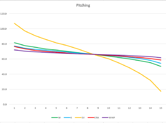
In both cases, the orange line represents the categories with the widest distributions (steals and saves) while the purple line illustrates the stats with the tightest bunching (batting average and WHIP).
At least according to this model, the most movement should emanate within batting average and WHIP with the least from steals and saves. Again, this doesn't mean don't even try to gain in steals or saves, as you may be at a spot in the standings where several points are in play. The more relevant takeaway is even though some team managers see how close they are to the next few teams in the ratio categories, they dismiss the notion they can still gain points. This is simply not true; a lot of movement occurs in the ratios, right through the end of the season. The reason is two-fold. First is the clustered nature illustrated above. The other is not only can you improve your ratios, your competitors can get worse. It's possible to gain ERA and WHIP points on the last day of the season even if you don't have any active pitchers.
Let's circle back to the polls. My followers voted for stolen bases to be the hitting category where you can gain or lose the most points. While this is exactly the opposite of what is indicated by the normalized standings, there is another factor at work. The SGP uses a fewest squares fit, drawing a straight line between the 2nd and 14th place teams. However, the distribution tends to be much more of an S-curve than the other categories, which are more linear. That is, the delta between teams at the top and bottom of the standings is broader. Meanwhile, the middle clubs are tightly bunched, allowing more movement in either direction. Furthermore, the steals category can be more efficiently addressed with specialists.
The voters pegged batting average as the category in which the fewest points can be gained or lost, no doubt feeling the buildup of at-bats prohibits movement within the category. As can be gleaned from the flatness of the batting average curve above, amassing at-bats may create some standings inertia, but is doesn't prohibit rising or falling in the standings. You may not be able to move much, but it isn't necessary to move much. Plus, teams ahead of you can have a rough day at the plate and help narrow the gap(s).
It's interesting how so few surmised the difficulty in gaining or losing points in home runs. Based on the curves, they're right, at least relative to everything but steals. However, the catch is my research shows winning teams fare best in the homer category since RBI and runs dovetail with it. The point is, while it may be a little more arduous to gain points in the category, more long balls also mean more runs and RBI thus and hopefully more points in all three categories, especially since the latter pair are more tightly bunched.
It may seem curious how the pollsters tagged ERA and WHIP as both the most likely to gain or lose the most points, and most likely to gain or lose the fewest. However, there is a logical explanation. This is not the first time I have broached this topic, and with 32.4 percent of the responders viewing ERA and WHIP as leading to the most movement, it's fair to say 32.4 percent have read my work in this area and were predisposed to that result. That said, I still have work to do with 35.1 percent of the voters intuiting little movement is likely in ERA and WHIP.
It's interesting to note that saves finished in the middle of each poll, while stolen bases was deemed the one in which movement was easiest. The two are similar in that their slope is steep, but they can be influenced by the fewest number of players. The main difference is available saves seem to emerge more than in-season stolen base contributors, yet the voters still felt they could manage the stolen base category with greater success than saves.
As a final reminder, the key to individual success in moving up within a category is where you actually are in your league. An individual league's standings will not mimic what is displayed above, as there will be irregular gaps among each stat. Calculating average standings smooths things to what is presented above.
This does not render the analysis worthless, or at least non-actionable. Knowing your opponents' mindset helps grease the skids for deals. If they're among those who feel it's hard to gain or lose points in homers, perhaps they'll be more willing to deal a slugger, thereby helping you in three categories. Similar analysis can be applied to other categories.
Confession time: All of the above is simply words. After all the years of playing and writing about the game, I have never actually conducted an experiment that involved capturing standings at the midpoint and comparing them to the final version to measure category movement. As soon as I come up with a pithy title and send this piece to the editors, I am going to archive the halfway points standings from LABR, Tout Wars, my NFBC leagues and a few others. After the season, I'll compare them to the final standings and gauge the movement in each of the 10 rotisserie categories. Look for the results in October. That said, one season's standings in a handful of leagues for which I have access is just one data point. I'll need to conduct the experiment multiple times to get a definitive answer.
Good luck in your quest to either track down and catch your competitors or hopefully fend them off. Regardless, do not categorically ignore ratios!